Chris Willis

Chris Willis / Bio

I'm a strategic design leader building products that feel genuinely human.

I'm the founding Chief Design Officer and Futurist at Domo. For 15 years I've helped build one of the best cloud-native, mobile-first data analytics platforms, and now with governed, agentic AI that real people can actually use. I take a first-principles approach to AI and innovation, starting with the human problem instead of the cool demo.

What I'm known for

Selected projects

A curated selection of work, with more on the way...

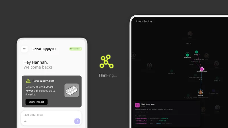
2026 Intent Engine

Giving AI agents the business context to act on what people mean
2026 App Studio

A visual canvas for designing, generating and publishing data apps

Domo App Studio editor with a block library, a page in progress and a properties panel

2026

A unified data grid for fast, frictionless exploration of DataSets of any size
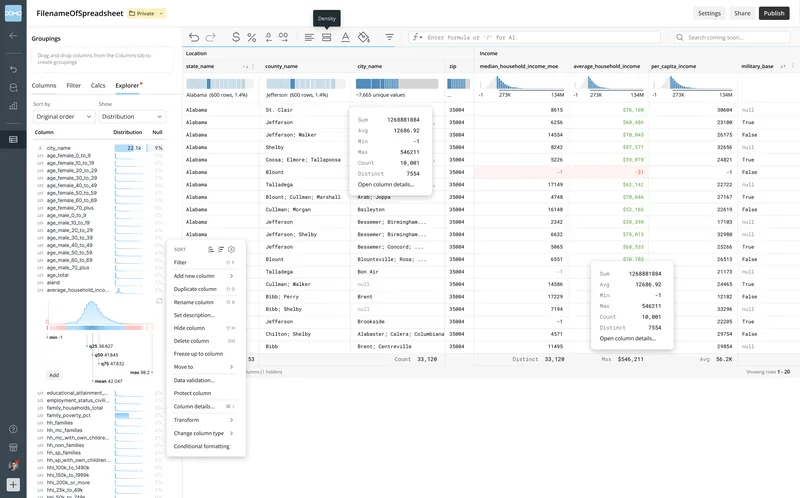
SuperGrid showing value distributions in every column header, column stats and a column menu

2024 AI Readiness

Showing people what to fix before their data meets AI
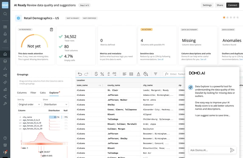
Domo's AI Readiness screen rating a retail dataset “Not yet” and suggesting fixes, with Domo.AI offering to help

2023 Improved Domo Workflow Engine

Turning business automation into flows anyone can read and edit
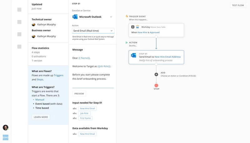
A Domo workflow for new hire onboarding: when Workday approves a new hire, Outlook sends them a welcome email

In the media

Selected writings

  1. The innovator's new dilemma Leaders are demanding moonshots from AI. The better bet is getting 1 percent better every day. · Utah Business
  2. The trust gap What a failed bank project taught me about the invisible architecture of organizations · Medium

Before Domo

The full story is on LinkedIn.

Brands I've worked with

Outside of work

If you're building the future of work, or just looking for a spirited chat about it, let's talk.

Selected experiments

A red line for 2026 climbs above a curved grid of standard deviations and dozens of gray lines for earlier years of Pacific sea-surface temperature
Some monsters are real. The 2026 El Niño, charted live Eliot Jacobson warned that a Godzilla El Niño was coming; Fil, an author of D3, turned the warning into a chart that warps the grid instead of the data. This page rebuilds it from NOAA’s daily sea-surface temperatures every time it loads: the Niño 3.4 region drawn against curves of one, two, three and four standard deviations, with 2026 already past the top of the paper. Live satellite imagery, the build-up charts, a computed equatorial Hovmöller, every El Niño since 1950 on one calendar, and the forecasts.
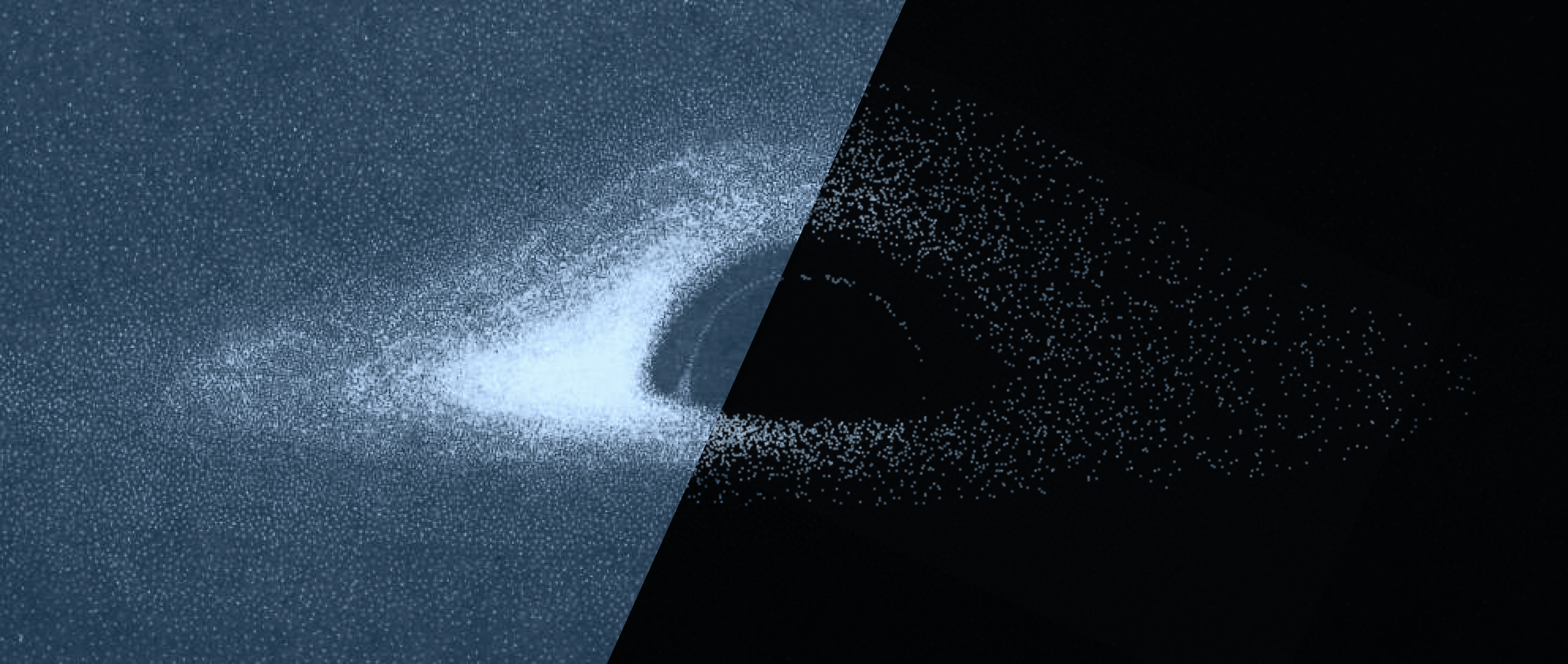
A dot-rendered simulation of a black hole: a bright accretion disk bending around a dark shadow
A tribute to Luminet's first portrait of a black hole In 1978 nobody had seen a black hole, and nobody expected to. Jean-Pierre Luminet, a young astrophysicist at the Paris Observatory in Meudon, let the math show him something unique about the universe. He computed the view on an old IBM 7040 and painted the portrait by hand. I used his original equations to recreate his paper in the browser.
The words stop whining and take in white serif type, wrapped in dozens of thin concentric outlines on a red ground
Yves Outlines. Generate posters with type that ripples Inspired by Yves Béhar's type treatment on Design Manifestos (from ICON magazine, Issue 50, August 2007). Tiny app grows thin concentric outlines around any letters and words, like rings spreading from a stone dropped in water. Choose a typeface, adjust the rings and the background color, and export your own manifesto as a png.
The Flexoki palette as a 3D surface beside a color picker map and a generated 13-step ramp
Mapping the shape of a color palette It started with Steph Ango's Flexoki, a palette inspired by ink on paper. Wrapping its colors around a 3D surface revealed a hidden shape, a kind of DNA, and the same method can look inside any palette. That surface then becomes the engine for a color picker. It shows where the palette has real colors and where it's guessing, and it can generate new colors that harmoniously fit the family.
Tailwind's color ramps in a grid with a new purple ramp slotted in among them, beside the new ramp drawn large with the starting color circled
Ramp from one color A simpler spinoff of the palette map. Start with one color, such as a brand color, and get a full ramp of light and dark steps shaped like Tailwind, Radix, Flexoki, seven other design systems or your own imported palette. It estimates how close each step is to what that system's designers would have picked, shows which steps pass for text, and exports CSS, Tailwind or design tokens.